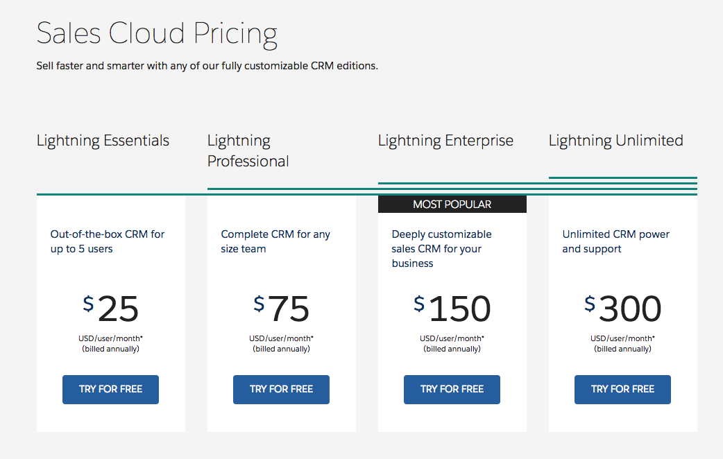
DASHBOARD REPORTING TOOLS
Implement from the Dashboard Down: Design with the End in Mind
Use Dashboards to Write the Story of Your Business
Dale Warner, Vice President of Sales at BombBomb.com, used a spreadsheet to measure the business. And it was a beautiful spreadsheet. He could plug in variables and know what income to expect or if he needed to hire a new sales rep.
But the spreadsheet had limitations. Data had to be gathered from other reports and entered manually into the spreadsheet. It would have to be uploaded and emailed around the office. If changes needed to be made to the spreadsheet, he would have to wait for the Excel guru to help him. Perhaps the biggest disadvantage of running the sales department from a spreadsheet is that the data was a story what happened. Because it wasn’t in real time, Warner couldn’t see leading indicators that could have changed the story mid-sentence. The spreadsheet’s story was set in stone.
Warner, who had previous experience with Salesforce CRM software, implemented the CRM solution for the burgeoning video email marketing service. “Real-time results drive daily decisions,” says Warner, who knew he needed a daily picture of two leading indicators (actions happening currently like number of daily calls or conversions) for every one lagging indicator (results of the past like monthly revenue). “If we don’t know until the end of the month how we did, [reporting is] useless,“ stresses Warner.
Matthew Dolev, Success Manager at Salesforce, gives insights for using the Salesforce dashboard reporting services to capture live data that will help you run your business with quicker reaction times and course corrections. Furthermore, dashboards can drive desired behaviour within the organisation.
The dashboard reporting tools available on both Salesforce classic UI and Salesforce Lightning are fully customisable to your business needs. Here are some suggestions to make the most out of the CRM industry’s leading dashboard reporting software:
Know the End Before You Begin
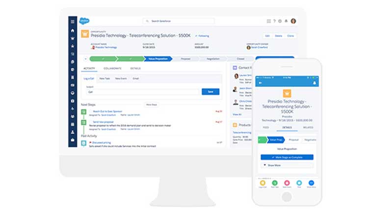
When designing your reporting screen using Salesforce dashboard reporting software, take the end-user into consideration as you choose the metrics you want to see daily. Salesforce dashboard reporting software offers a variety of customisable choices when setting up your dashboard. You can choose to see bar graphs, pie charts, or line graphs. Reports will vary based on your industry and company goals but might include rep performance, revenue by month, quotas, phone calls, wins/losses, closed sales, or conversions.
Know your end user. Identify who will be seeing the dashboard daily and design with that person in mind. Have executives weigh in with their insights so the dashboard can show targeted KPIs. Sales reps will want to see how close they are to their sales goal. Use the charts that matter most and can motivate actions towards goals.
Assign metrics that match your company vision. As a company, decide what measurements are important and what information will drive your business pace. Those are the metrics to set up on the financial dashboard software. Company goals should be reflected in the dashboards.
Capture the right data. The common saying rings true, you can’t manage what you don’t measure. When using financial dashboard software to design your home screen, be certain to include data for processes important to measure. Develop a clear and concise naming strategy so everyone knows what type of measurement is being reported.
Determine who will have access to the dashboards. Salesforce dashboard reporting services allow system administrators to specify access to reports to by user and to place security controls. While restricting access to certain dashboards reports may be important depending on the industry, BombBomb.com gives all users access to every report. Warner says it creates a culture of unity and makes everyone in the company feel at ease because there is open access among employees to their sales information.
Once you have a vision for the end result, it’s time to build your dashboard. The Salesforce App Exchange has several pre-built dashboards ready to plug in. There are dashboard specific to executives, managers, sales, marketing, and a variety of other uses. Most users, however, when they see how intuitive it is to build a dashboard, choose to customise.
Design Your Dashboards for Readability
Salesforce's dashboard reporting tools are a powerful data-reporting software program but they are also a thing of beauty. With the user interface redesign of Salesforce Lightning, the dashboards are even more effective and visually appealing.
When designing your dashboards, keep the following principles of readability in mind to get maximum efficiency:
Start with a simple dashboard and add to it. Dolev recommends starting simply with a few key measurements and customising in increments. “If there’s anything missing...in the first iteration, keep customising,” advises Dolev. By setting up your dashboard reporting in stages, you’ll be able to use the tools faster and see results.
The top, upper-lefthand corner of the dashboard is prime real estate. Readers who read left to right and top to bottom instinctively look at that portion of a document. It goes to follow that the most important information.
Headers and footers should call out components by name. Charts are visually stunning, but without a label, users will take too much time deciphering the meaning. Clear labels in the headers and footers draw attention to the metrics and the behaviours behind the metrics.
Keep similar information in the same column or row. Columns versus rows is a topic of much debate among Salesforce customers. Whichever you prefer, organise your information by grouping like data. “You want the story to be continuous. You want everything that is alike for each part of your dashboard to be in that straight visual line,” explains Dolev. Organising your information by categories helps the user better digest the information and be able to react to it.
Write Your Story (Past and Present) With Dashboards
While dashboards can report past performance, the value is in the real-time insights. Scheduled delivery allows reports to be emailed regularly. Warner has reports emailed to him each morning. That way, he knows what adjustments need to be made in sales strategy during the day. Having the visual reports allows for quick digestion of the data. “I know exactly what needs work and what’s doing really well,” says Warner. “[The dashboard reports] give us the ability to move quickly and an immediate sense of where you stand.”
Dashboards give a sense of accountability to the entire organisation, says Warner. Sales, marketing, accounting, management can all see company performance. The real-time data destroys the excuse ‘I don’t have that information today.’ The reporting features of the dashboard also drive behaviours. Dolev suggests holding meetings with the dashboards projected behind you so people can see the numbers.
Seeing progress towards goals is motivating. When everyone clear visual indicators of progress and the steps needed to reach goals, your company actively writes its story. Rather than waiting to read the for the month-end reports, your company can create its own story.