Great experiences with technology should be for everyone, and it’s up to the people who build that technology to ensure an inclusive experience. Our Product Accessibility and Inclusive Design team identifies where we can make updates that make users’ lives easier and, in doing so, help them make the most of Salesforce’s many tools for AI, data, and customer relationship management (CRM).
Today, Salesforce is celebrating Global Accessibility Awareness Day with product improvements that help us translate awareness into action. Specifically, we’re introducing color contrast updates to make the Salesforce Lightning experience more accessible and inclusive for all users.
Today, Salesforce is celebrating Global Accessibility Awareness Day with product improvements that help us translate awareness into action.
These accessibility updates will make it easier to take in visual information such as text, icons, warnings messages, buttons, and more. Users with low vision, or who might otherwise find it difficult to differentiate between low-contrast colors, will more quickly and easily see important UI elements, making it easier for them to use Salesforce.
What’s coming: Contrast updates to Lightning experience platforms
The changes will include improvements to components, design tokens, styling hooks, and icons. This includes the patterns that impact certain areas of the User Interface (UI), where the background or the border of a functional component, like a button, needs to have increased contrast.
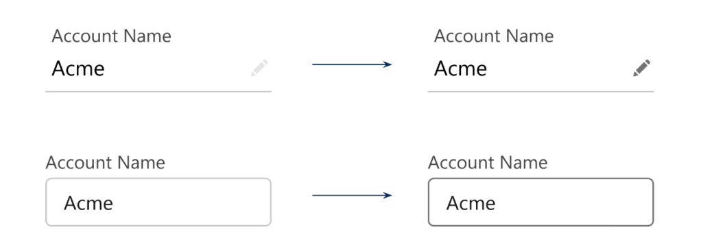
As an example, let’s look at how inputs, neutral buttons, and links, will change:
Inputs — fields that require a response from the user — will be easier to quickly identify with more contrast. And, the increased contrast will extend to edit icons, which are also functional parts of the UI.
Our link color is also being updated to ensure it passes color contrast for text on white and gray backgrounds:
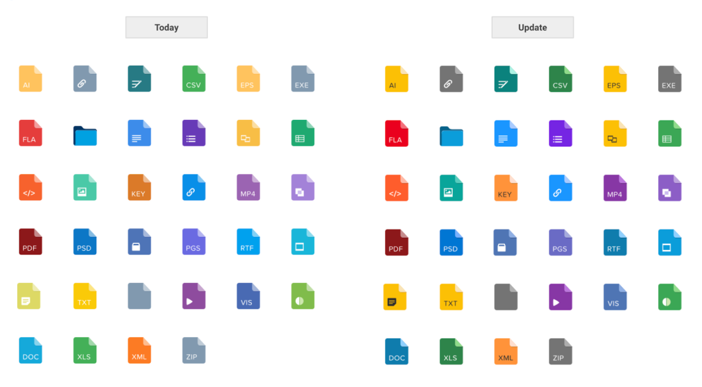
Standard Object, Action, and Doctype icons will also have improved contrast for easier recognition of visual information. All of these colors will come from the Salesforce Color System, which provides standardized colors to make it easier to deliver a consistent look and experience for our users.
Doctype modifications are minimal:
Standard Object and Action icon backgrounds will be migrated to our new iconography palette, built from our color system. This new palette was created to ensure white glyphs on top of colored backgrounds are easily distinguishable:
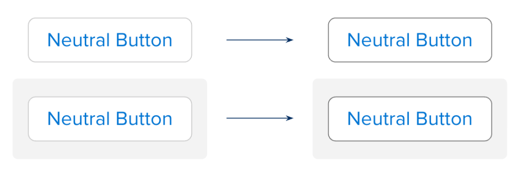
We’re extending the same treatment to neutral buttons as well, to ensure that they’re easily recognizable as actionable in many different Salesforce contexts.
The neutral button’s border will have an increased contrast based on the Web Accessibility Content Guidelines (WCAG) recommendation that reads, “Note that for people with cognitive disabilities it is recommended to delineate the boundary of controls to aid in the recognition of controls and therefore the completion of activities.”
Today, neutral buttons are commonly used across the Lightning experience. As we implement this change, however, all buttons using a gray border will receive a darker order. This also includes button icons, button groups, checkboxes, and radio groups.
For more information on the specific changes in the Summer ‘23 release, check out our release note.
Why these accessibility updates begin with Lightning
The Lighting experience is the go-to way that customers create and fine-tune Salesforce. It was designed with ease of use in mind, and improvements to contrast will help us improve the experience for everyone, and especially for users with low vision. Beyond the clear compliance and broader market benefits for our customers, these changes help us celebrate accessibility awareness and action with practical product improvements.
Of course, for Salesforce and for any business, accessibility and inclusion is most successful when it’s built in right from the start. We strive to design all of our products with a wide range of users with an equally wide range of abilities and lived experiences in mind. Including more diverse perspectives earlier in the design process helps us “shift left” – moving away from fixing accessibility concerns after they’re in a product and toward identifying and addressing those concerns in research, design, and development.
In doing so, we can both improve the Salesforce experience that exists today and design with our learnings in mind as we move forward, building toward a world with more accessible tech for all.
Learn more:
- For in-depth information, examples, and user guides, visit the Admin blog
- Read more on the Salesforce Lightning Design System
- Dive deeper on the Product Accessibility Status Information page
- Get started with Web Accessibility at Salesforce


