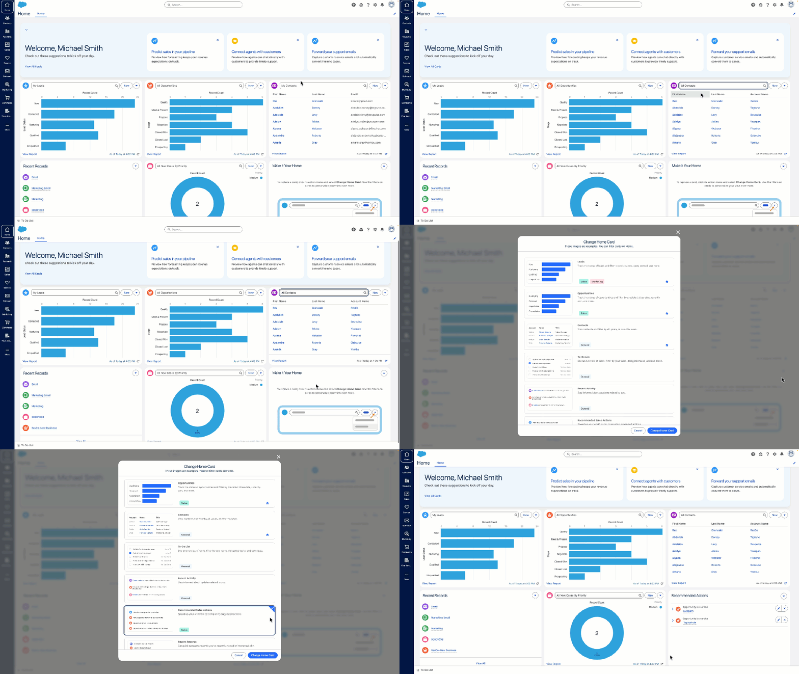
The enhanced Lightning user interface has a modern design with intuitive navigation for improved accessibility and efficiency
Salesforce has rolled out its enhanced Lightning user interface (UI) across both Starter and Pro Suite — all-in-one sales, service, marketing, and commerce solutions that help small and growing businesses get started and scale on the #1 AI CRM.
Changes to the UI design in Starter and Pro include streamlined navigation, simplified icons, and improved use of colors to prioritize information. These enhancements help customers easily visualize and complete tasks like track sales leads, manage customer service cases, send customer emails, collect direct payments, and more — all from one seamless application.
Here, Kat Holmes, EVP and Chief Design Officer of Salesforce, discusses how the enhanced UI makes it easier, faster, and more accessible for customers to get started and grow with Salesforce.
Q. Why did Salesforce update the Starter and Pro Suite UI?
Starter and Pro Suite bring our most relevant capabilities to customers so everyone can use Salesforce to grow their business. That’s why these updates are so important: We are pushing toward a simple user experience that makes it easy for anyone to get started fast and drive value with Salesforce.
Our design team works closely with customers on the usability of our products, and that feedback is reflected in these design enhancements. These customers have told us that they want a user interface that is easy to learn, easy to use, and visually appealing. We have built these elements into each facet of the design out-of-the box, so users have easy access to the latest enhancements.
We are also working closely with Salesforce’s engineering team to make sure the design is supported by our underlying platform. This means that customers automatically get access to new updates, which can include design elements, accessibility features, and more.

Q. What can users look forward to seeing in the UI?
This update isn’t just aesthetic. It’s an improvement to how Salesforce works. We’re pushing our design to organize information to be clear and consistent so users can focus on what matters most, getting work done efficiently. Here are some of my favorite changes:
- Color: The colors are improved for contrast and readability, but they are still a familiar part of the Salesforce color system. This creates a clean and modern aesthetic that reduces cognitive load during tasks.
- Typography: We’ve improved readability by revamping the type and font scale. Our strategic use of colors, spacing, and alignment helps users more easily find the data and insights that help their business grow.
- Organization: Users can now navigate Salesforce apps more quickly and effortlessly thanks to streamlined navigation, simplified icons, at-a-glance views that make it easy to view relevant information, and adaptable spacing that can make text easier to read.
- Inviting Cues: We’ve integrated real-world elements into our design to make it more familiar and appealing for users, while helping them perform tasks faster. Design details like drop shadows and gradients on buttons help users differentiate between content to read and actions to execute.

Q. Starter and Pro Suite are the first Salesforce solutions to receive the enhanced UI. What is the strategy behind that?
Starter and Pro are designed for small and growing businesses who might not have the resources to hire specialized teams and individuals trained on using Salesforce.
These customers need to move easily between sales, service, and marketing tasks all in one single user interface. They need the experience to be fast and effective. Starter and Pro Suite customers expect our design to keep up with their pace of work, and they inspire us to raise our bar every day.
Q. What’s been the feedback on the refreshed UI so far?
Customers love the simplified, modern experience, and tell us it’s more approachable.
Growing businesses want solutions that are both easy to use and powerful — a great UI is how customers will make the most of our great data and AI solutions. This design update is an important step toward that future.
Beyond liking the updated look and feel, customers tell us they feel more empowered and in control. In testing, the clearer UI has led to increased readability and improved productivity. That’s exactly the kind of feedback and results we wanted. We’re thrilled that these updates make our product accessible to more customers, and we look forward to learning how we can help growing businesses thrive.
Growing businesses want solutions that are both easy to use and powerful — a great UI is how customers will make the most of our great data and AI solutions. This design update is an important step toward that future.
Kat Holmes, EVP and Chief Design Officer of Salesforce
More information:
- Explore how Starter and Pro Suite can help businesses get started fast and grow quickly
- Learn more about the refreshed visual design


