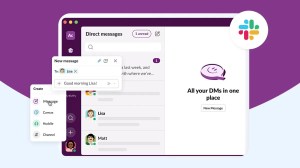
Today, Salesforce announced it will roll out a major design update to Slack over the coming months that makes it easier for users to navigate the platform, stay focused, and better access a growing number of essential tools necessary for modern work.
Why it’s relevant:
- Businesses are increasingly looking for new ways of working and tools to support efficiency. In fact, the majority of leaders (71%) say they’re under pressure from their company’s management to make their teams more productive.
- However, studies also show that business app volumes within organizations have increased nearly 10% in the past year, surpassing 1,000 on average. Plus fewer than 30% are integrated, creating data silos that lead to rising costs, duplicated work, productivity bottlenecks, and disconnected experiences.
- Bottom line: Companies that can centralize their people and tools they use every day in one place will get work done more efficiently, and increase productivity. With Slack, businesses have a command center for modern work that seamlessly integrates their apps into one place, automating admin and time-consuming processes, and bringing teams into one platform to collaborate.
Innovation in action: The newest evolution of Slack makes it easier for users to navigate their channels and conversations so they work faster with their teammates; focus on what’s important so they can knock out tasks without distractions; and use essential tools so they can simplify their work day:
- A single view for navigating to what’s important: A default home view for channels, direct messages, and apps makes it easy for people to quickly find what they need, no matter how big their company. For teams on Enterprise Grid accounts, they’ll now have the ability to view channels from every workspace, all in Home. That means they can hone in on the information that’s most important without having to toggle back and forth across different workspaces.
- Dedicated focus for uninterrupted work: New dedicated views help teams better focus their attention, navigate tools and conversations faster, and peek into other work with hover functionality. Designed to give teams more control over where they’re spending their time, this new structure supports the different ways of working in Slack – whether that’s focused work or collaborating with colleagues. For example:
- As teams start their day, they can jump into Activity to get up to speed on work that’s in motion and important to them.
- They can then set aside time to respond to their unread Direct Messages when they’re in between meetings.
- And, when they need to come back to a message or action item, they can simply save it to Later — where they can even set a reminder to make sure it’s completed on time.
- In More, they’ll also find tools that help them be productive — including canvas, workflows, and apps.*
- The most useful tools, one click away: Moving quickly on routine actions is a small but powerful way to give teams time back in their day for more meaningful work. A new “create” button puts tools within reach, allowing teams to not only start new messages but also channels, canvases, and huddles. And a new update to the Search experience means they can now click into each result to see its full context without having to jump back and forth as they look for what they need.
The Salesforce perspective: “We know millions of people start and end their workday in Slack, so we took great care to ensure these improvements make it a more productive and pleasant home. The new experience helps teams stay better organized, focus on what’s important, and quickly access a growing set of tools in Slack.” — Noah Weiss, Chief Product Officer, Slack
We know millions of people start and end their workday in Slack, so we took great care to ensure these improvements make it a more productive and pleasant home. The new experience helps teams stay better organized, focus on what’s important, and quickly access a growing set of tools in Slack.
Noah Weiss, Chief Product Officer, Slack
Reaction to the news:
- “Over the years, Slack’s value has grown from being a helpful tool that keeps us connected to our primary platform — one that is essential to our operations. This new interface has further optimized our workspace, allowing us to stay better focused and keep momentum going on tasks while making it easier to quickly access our favorite tools in Slack.” — Andy Kahn, Manager of Artist Relations, Sixthman
- “Slack continues to evolve its productivity platform to meet changing workplace and workspace needs. Slack did more than respond to customer requests: With this user interface update, Slack made it easier for people to better control their flow of work and maintain focus on what matters most to each individual user. At the same time, these updates create a path for more substantial features in the future.” — Wayne Kurtzman, Vice President of Social, Communities and Collaboration, IDC
Explore more:
- The new user experience will begin rolling out to new teams starting today, and will reach existing users over the coming months
- To learn more about the new Slack interface, check out this Slack blog post
- For more information about what’s changing and to get answers to common questions, check out the Slack Help Center
*Note: More functionality differs slightly for free and paid plans.


