Can’t Wait to Use the New UI Design? Tap Into Insights from Dreamforce First
Hot topics included night mode, the updated visual style for the Lightning user interface, and the future of product design at Salesforce.

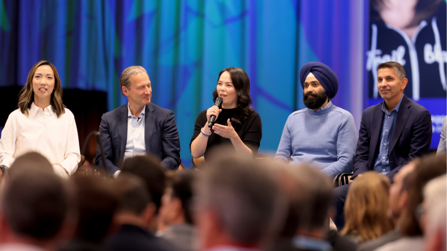
People are pumped about the new visual design that’s gradually rolling out across new Salesforce editions. At Dreamforce ’24, experts from the Salesforce Product UX team showcased the updates to the user interface (UI) and shared best practices for the Salesforce Lightning Design System (SLDS). The most common question from attendees was: “When can I use the new design?”
Let’s answer that question. Whether you attended Dreamforce in person or joined online, here’s what you need to know:
What is the new UI design?
When will the new design be available?
Five takeaways from Dreamforce about the new design and SLDS
Get a peek at the future of Salesforce design
What you can expect in the Spring ’25 release
What is the new UI design?
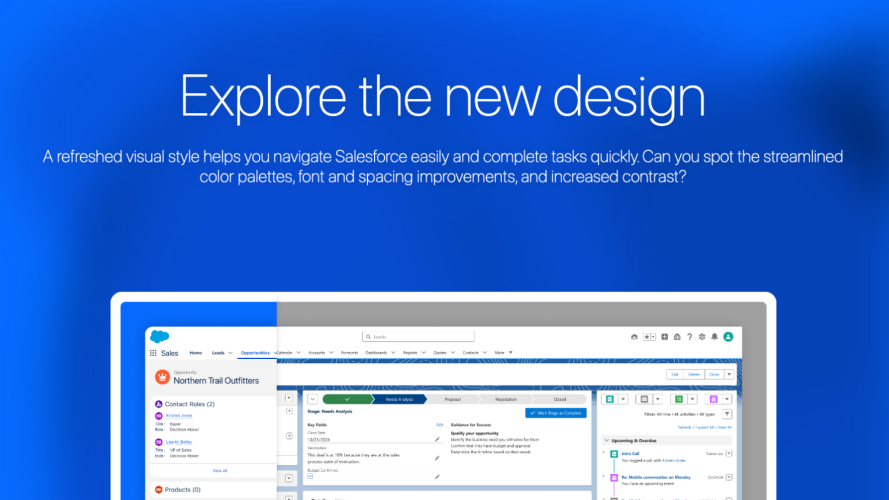
The new UI design offers a modern look, with simplified icons, colors, font typography scale, and more. These changes help people navigate Salesforce products with greater confidence, clarity, and ease. Also, usability and accessibility benefits are built into the new design in a way that can scale over each release.
Developers and designers will appreciate that the changes are opt-in and CSS-based only, and don’t affect the functionality of the Salesforce Platform.
Importantly, the new design is a preview of what’s possible with SLDS 2, which we aim to release in beta in Spring ’25.
When will the new design be available?
As much as we’d like to flip a switch and turn on the new design for every customer, the process involves many considerations that require a gradual and thoughtful approach. New and existing customers who have Starter Suite or Pro Suite have the new design. Also, new orgs across a selection of Sales Cloud and Service Cloud editions have the new design.
To check whether you have access to the new design, go to the Setup User Interface toggle to confirm whether the “Turn on an enhanced Lightning user interface” option is enabled. Visit Salesforce Help for a complete availability list.
Get Familiar with the New Design


Five takeaways from Dreamforce sessions about the new UI design and SLDS
At Dreamforce, attendees learned essential information about the new design and got a preview of what eventually will be possible with SLDS 2. Here are some takeaways from those sessions:
1. Intentional design choices lead to great experiences
The new UI design is an introduction to our broader vision to make Salesforce fast, easy, and compelling to use – and built for AI. How the design decisions improve the user experience are in the details. Check out details of the new UI design in the session deck.
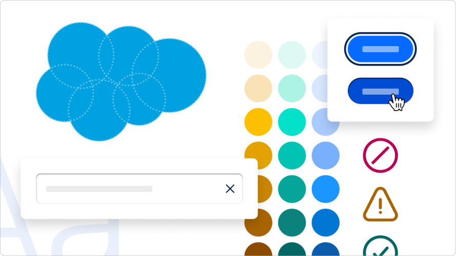
2. Embrace using SLDS
A design system improves the designer-to-developer workflow by providing a comprehensive set of standards, documentation, and reusable components. SLDS serves this function and continues to evolve as Salesforce matures. Updates to the architecture will enable you to adopt future innovations – such as night mode. View session deck.
3. Consistent SLDS practices help future-proof your code
Highlights of best practices include upgrading your styling API, avoiding hard-coded values, and avoiding styling SLDS classes. Also, using the improved SLDS Validator makes it easier to scan your code for recommended fixes. View the session deck for code examples.
4. Say yes to the power of styling hooks
Global styling hooks can be applied across various HTML elements, components, and selectors. This makes hooks a powerful way to ensure you achieve a uniform look and feel across an application. View the session deck to learn the anatomy of styling hooks.
5. More toggling and less detaching
The new Figma kit bridges the workflow between design and engineering, creating a shared language. And, with one-to-one mapping, this also ensures that what’s in the design shows up correctly in the live environment. A key best practice is to use the toggling function in Figma versus detaching components. Get a tour of the Figma kit in the session deck.
Get a peek at the future of Salesforce design
To put all the work into the context of our roadmap, Kat Holmes, EVP and Chief Design Officer, Salesforce, shared a behind-the-scenes perspective of the future of Salesforce product design. “As a leader, my commitment is to go a level deeper into the technology,” Holmes said. “And understand from an engineering and a design standpoint how to make meaningful progress toward making Salesforce fast, compelling and easy for everyone to use.”

What you can expect in the Spring ’25 release
The big news for the Spring ’25 release is that SLDS 2 will launch in beta. SLDS 2 will bring a much more flexible and composable design system. That flexibility enables advanced user preferences, like night mode, and ensures design and product updates happen without breaking the system.
We’re as eager to deliver new capabilities as you are to receive them.


