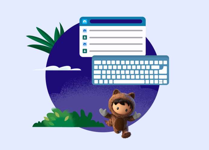
When we design AI interfaces, we always ask: Can I do it with a keyboard alone? There are many ways to navigate beyond solely using a mouse. Some people are supported by a head wand, a switch control, or another assistive device to operate their computer. For these tools to work, each needs keyboard access. Knowing this, we all have a responsibility to address accessibility barriers and design inclusive products.
Our team asked this keyboard question when we designed our conversational AI assistant, Agentforce.
Throughout the process, we prioritized accessible design standards. The Product Accessibility and Inclusive Design (PAID) team focused on best practices for alternate navigation, chat notifications, and button labels. Today, we’re sharing how the application of these concepts led to a more usable product.
What you’ll learn
- What is an accessibility barrier?
- Best Practice 1: Design AI interfaces with alternate navigation paths
- Best Practice 2: Announce when chat responses appear
- Best Practice 3: Clearly label additional information
What is an accessibility barrier?
An accessibility barrier prohibits people from accessing services and information. In the physical world, a building entrance that has stairs but doesn’t have a ramp is an example of an accessibility barrier. It limits entry for lots of people. Ramps help those with wheelchairs, strollers, and delivery handcarts, or folks with low vision or limited mobility who prefer an alternative to the elevation changes of each narrow stair.
Good design benefits everyone. Similarly, in the digital world, AI interfaces without key accommodations can exclude users.
We want to avoid barriers as we design the newest user interfaces: chat layouts for AI assistants.
Chats often include an open text field and a vertical stream of responses in a side panel. So what are the interaction points in this design? We think about users who navigate with a mouse, voice dictation, or assistive technology such as a screen reader. It’s critical that the AI interface is free of obstacles for keyboard users. Otherwise, it’s a mismatched interaction.
“Mismatches create a huge barrier to many users with disabilities,” said Stephanie Louraine, Salesforce Lead Digital Accessibility Engineer. “For example, those who have motor impairments can have limited use of a mouse or pointer device. Additionally, blind or low-vision users who use a screen reader interact with interfaces using a keyboard.”
As part of the PAID team, Louraine provides integrative accessibility support to our AI design and development teams. The result is ethical and inclusive AI experiences.
Accessible design is essential. We can’t leave best practices behind in the age of AI.
Start with AI Copilot Basics
Best Practice 1: Design AI interfaces with alternate navigation paths
To be operable, interfaces need multiple ways to complete a task. Our team considered this in the selection-menu design for Prompt Builder.
First, let’s talk about where this menu lives.

Say you’re using Agentforce to get more done in the flow of work. Our customers ask their AI assistant for instructions, custom close plans, and answers to common questions. They might start their day with a prompt like, “summarize this account and show me the highlights.”
Prompt Builder enables anyone to customize and create prompts to use in Agentforce. To ground the prompt — or add context to it — there are a few steps. It includes selecting resources such as customer relationship management (CRM) data.
Designing alternate navigation paths matters at every interaction point. It’s even important for the selection menu.
If users need a mouse to select their CRM data, then keyboard users can’t complete that task. Today, they can complete this step thanks to custom scripting, labels, and tab navigation.
Including different ways to complete a task increases user success. This also applies to our design for Copilot’s chat interface.
Best Practice 2: Announce when chat responses appear
In all user experiences — especially ones involving fast-moving AI — communications need to be timely and detailed. Typically there are visual cues for generative AI chat responses. However, sight-based cues alone aren’t enough. All designs need to be perceivable to screen reader users, too.
Screen reader users rely on their software to announce status changes. When Agentforce responds to a prompt, it notifies the screen reader. The AI assistant also communicates if it needs time to process, takes an action, or gets an error.

To achieve this, our designers and developers marked the chat as a live region. The screen reader looks for new text and announces new content.
When communications are clear and frequent, keyboard users can take action.
Best Practice 3: Clearly label additional information
It’s frustrating when a screen reader announces the word “button” without more information. This can create confusion for users who are still learning how to use generative AI products.
Agentforce announces each button’s function to screen readers. For example: our labels differentiate a “more information button” from a “close button.”

It helped that the team used Lightning components from the Salesforce Lightning Design System. Each component has accessibility guidelines built in.
“Lightning components provide a consistent and accessible experience,” said Karen Herr, Salesforce Accessibility Foundations Director. Herr relied on these tools to answer the question: Can I do it with a keyboard alone?
Design AI Interfaces for All
Our commitment to accessible design ensures that keyboard users can complete critical tasks. Everyone should be able to ground prompts in CRM data, recognize Agentforce responses, and find more information. It’s part of why users trust our AI assistant.
It’s all possible because our team relies on accessible design best practices. Alternate navigation, chat notifications, and button labels are necessary for AI interfaces. This helps ensure that the benefits of the AI revolution are accessible to everyone.
Get to know Agentforce today.


