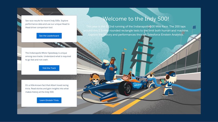
This weekend marks the 102nd Indianapolis 500, and Salesforce is revved up! With J.R. Hildebrand driving the Salesforce-sponsored car 66, and the event taking place in the hometown of our second largest office, Einstein Analytics is excited to join in on the action. For the first time ever, Salesforce is using the power of Einstein Analytics to do a deep-dive analysis of driver and race data as the competition heats up.

Analytics Pit Stop Experience
Onsite at the Indy 500 this Sunday, the Einstein Analytics team will host an interactive Analytics Pit Stop Experience to explore data from past Indy 500 races from 2011 to 2017. In the Analytics Pit Stop, attendees can click through data to surface insights via three different exploration tools:
- A leaderboard to compare top drivers by past race results, fastest lap, biggest movers (those who gained the most positions during the course of the race), laps led, and on-track passes:
- A driver comparison, pitting two drivers against each other to line up stats including starting position, average speed, time in pit stops, number of pit stops, laps led, and on-track passes over the years:
- An interactive race track that displays which driver had the fastest time and fastest average speed for each section of the track:
The Power of the Platform
The app is based entirely on IndyCar timing data collected since 2011. Timing data itself is quite simple: any time a car passes one of the many timelines around the Indianapolis Motor Speedway, a record is created that includes which car is crossing and the elapsed time since the race began.
But by using this simple data, we are able to derive all sorts of relevant insights that help provide a deeper understanding of each race as it unfolded. It allows us to identify where each car is on track at every point in the race, which in turn helps us to identify things like where and when passes occurred, how cars ran over a long stint (period of driving between pit stops), or which cars were best carrying their straightaway speed through the speedway’s four turns.
In order to bring the event to life in our workspace, we created a custom visualization along with multi-page and expandable cards to add another layer of interactivity. To do this, we used the custom shape capability that allows you to transform any shape (in this case, a racetrack) into an interactive chart and a "pages" features to view card-like details in the trivia section. These features make our dashboard a dynamic, visual representation of information.
Take a Test-Drive with Einstein Analytics
Salesforce guests at the racetrack this weekend can take a pit stop at our Analytics Experience, and for those watching the race at home, plug in your own data set to this Explore with Analytics trail to try Einstein Analytics yourself!


