We Refreshed Our Visual Design – Here’s How It Helps You Work Faster
Salesforce Cosmos, our new Lightning user interface design, is modern and improves the navigation, speed to task, and approachability for diverse users.

If you’ve ever updated the electrical wiring in your home or some other underlying aspect of a physical or digital infrastructure, you know how important foundational improvements are to their longevity. We refreshed the Lightning user interface design, bringing a modern visual style to Salesforce that makes it easier, faster, and more approachable for you to complete your tasks.
Called Salesforce Cosmos, the new interface design is available across a growing number of editions. So we want to talk you through key differences and what they might mean for your teams.
Here’s what we’ll cover:
What are the enhancements to the Lightning UI design?
How does Salesforce Cosmos help you work faster?
Key design updates
When will the Lightning UI enhancements be available?
Enriching the user experience

What are the enhancements to the Lightning UI design?
When we talk about a UI, we mean the framework or system that activates the visual design and user interactions on a screen. For Salesforce Cosmos, we’re referring specifically to the design updates we’ve made to the visual style – or the look and feel – of Salesforce.

As the refreshed visual style rolls out to all editions, it will be helpful for you to get some background on our approach to user interface design and how it may help your users work more efficiently.
In developing the enhancements to the visual style, we were decisive about what we would keep and what we would let go. We based design decisions on whether an experience met these five criteria:
- Seamless: has no awkward transitions, interruptions, or disparities; and is connected and unified.
- Responsive: is quick to respond or react appropriately; gets smarter with user input; and adapts to diverse personas, languages, cultures, and environments.
- Intuitive: is easy to learn, understand, and navigate without explicit instruction.
- Trusted: is reliable and stable, which ensures the user feels supported and guided.
- Delightful: is appealing, rewarding, and sparks joy.
Bringing these attributes together in the visual style reinforces our commitment to creating a trusted user experience (UX). It’s equally important that we continue to build a trusted relationship with you – our customers. We learn from your insights about the usability of our products. And we want to reflect your feedback in our user interface design.
How does Salesforce Cosmos help you work faster?
To understand how the new UI design can help you reduce time on task and be more productive, let’s consider the benefits first. We’ll dig into the user interface design elements that help drive productivity later.

Improved organization and harmony:
The streamlined navigation, simplified icons, at-a-glance views, adaptable spacing, and inviting cues are examples of how the new visual style makes it possible for you to move more seamlessly through the app. You can transition quickly from task to task, with digestible bites of information that ease cognitive load.
Clear indicators of success and prioritization:
Intentional use of colors, contrast, space, and icons help make data and the stage of opportunities pop. Clearly differentiated button states (default, hover, active) and other indicators help reduce time-consuming errors.
Improved performance and load times:
Reducing distracting images and optimizing the CSS code are examples of ways we’re maximizing compatibility across operating systems and devices. These steps allow new efficiencies and greater predictability.
Improved approachability and accessibility:
Making sure that our design adheres to web content accessibility guidelines (WCAG), accommodates users with a range of abilities, and can adapt to a range of neurodiversity needs is among our commitments.
While it’s harder to quantify, don’t underestimate the value of delight – the fun touches and sense of accomplishment – to make your users enjoy their experience more.
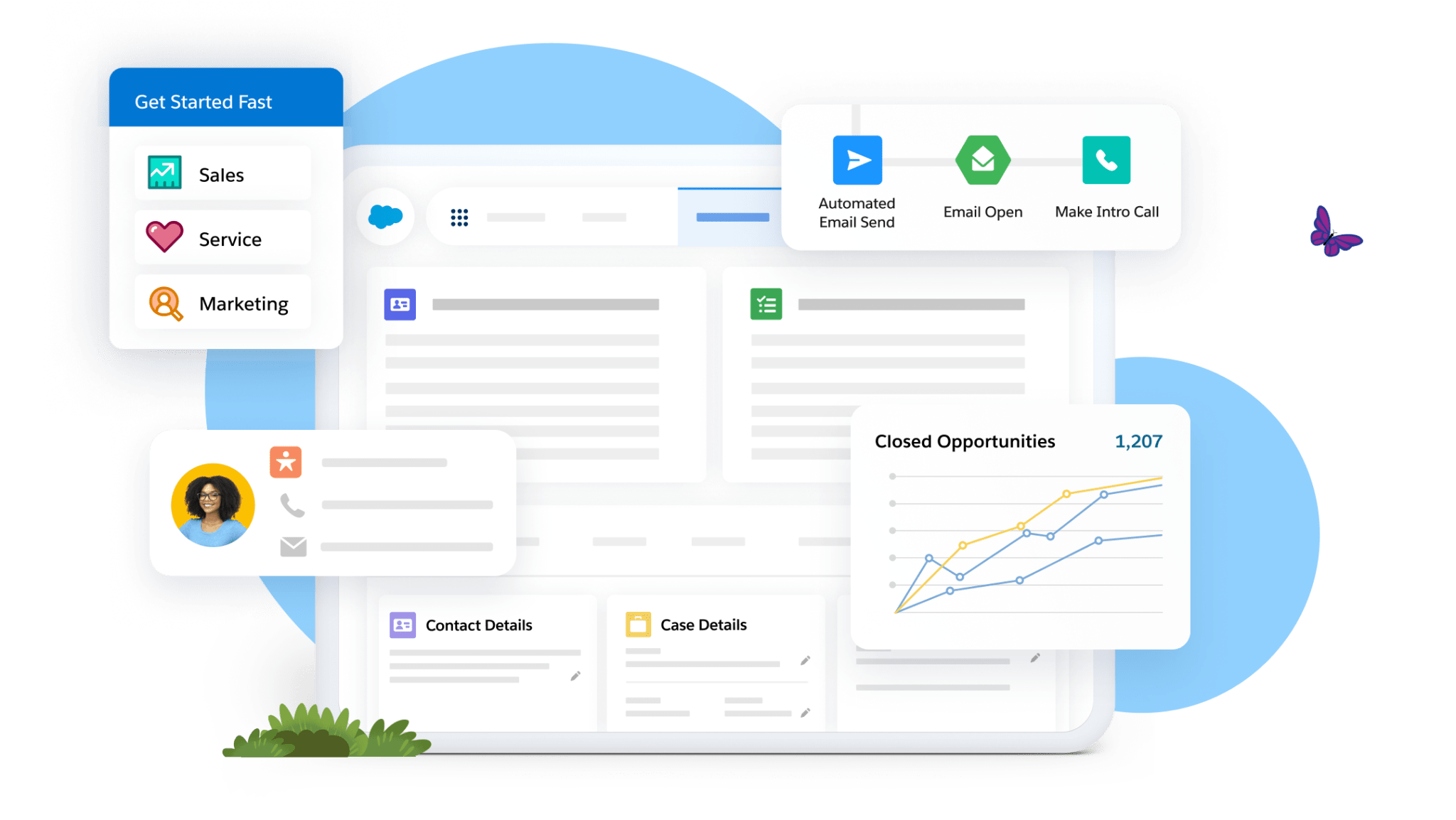
Get Started Fast with Salesforce Starter Suite


Key design updates
With artificial intelligence (AI) capabilities increasing at such a fast pace, we’ve had to think deeply about how to modify our visual style to reflect contemporary usability expectations our customers might have. Naturally, as technology gets more sophisticated, the design of interfaces needs to be simpler, less cluttered, and more intuitive.
Here are the elements that culminate in the enhanced UI design:
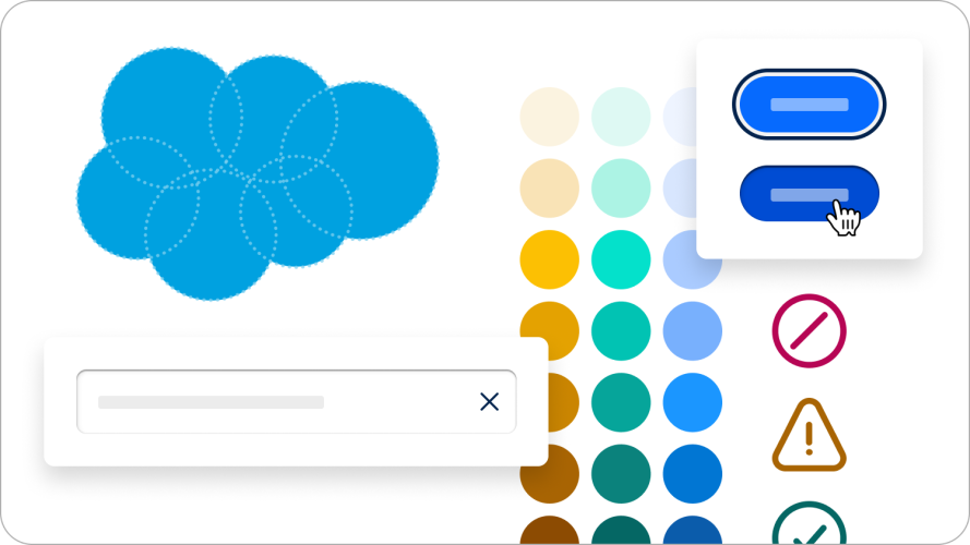
Circular motifs
We were inspired by the design of the Salesforce cloud, which is crafted from six overlapping circles. So we use circular shapes and rounded edges to convey friendliness, smoothness, and a welcoming feeling.

Improving icons
The progressive work to update icons helps to improve legibility at varying scales. It creates uniformity across our suite of apps and improves signal clarity. For example, whether a button is active or not.
Font sizing and weights
This revamp of the type and font scale enhances legibility. It helps the UI bring forward what matters most to users – data and insights.
Methodical color use
The colors in the refreshed visual style are derived from the Salesforce color system, but with improved brightness and contrast. So, this yields a cleaner and more saturated look that conveys a modern aesthetic.
Inviting cues
We introduced aspects of tangible objects from the real world to appeal to human senses and be more familiar and relatable. By adding cues to areas in the user interface design (such as drop shadows and gradients on buttons), we can delineate between content meant to be consumed versus actions to execute.
When you put all of these elements together, you get an experience that looks and feels less dense. It also has better readability and is easier to figure out how to use.
When will the Lightning UI enhancements be available?
For new customers
| Cloud | Edition | Effective Date | Orgs Included | Not Yet Available |
|---|---|---|---|---|
| – | Starter Suite | June 5, 2024 | All | None |
| – | Pro Suite | June 5, 2024 | All | None |
| Sales | Professional (PE) | June 27, 2024 | – Trial – Sandbox orgs created from new Sales cloud PE orgs | – Developer Edition (DE) orgs – Sandboxes created from old Sales Cloud PE orgs – Scratch orgs |
| Sales | Enterprise Edition (EE) | July 25, 2024 | – Trial – Sandboxes created from new Sales Cloud EE orgs | – DE orgs – Sandboxes created from old Sales Cloud EE orgs – Scratch orgs |
For existing customers
| Edition | Effective Date | Orgs Included |
|---|---|---|
| Starter Suite | June 5, 2024 | All |
| Pro Suite | June 5, 2024 | All |
Broader availability to new and existing orgs will be determined throughout the year. Read through the FAQ and make sure your organization is ready for the enhanced design. Also, check out out what developers need to know.
Enriching the user experience
The work to develop Salesforce Cosmos has been a long process to understand what our users need. Our refreshed visual style can help set you up for success now and for future innovations. Making Salesforce easier and faster isn’t always about piling on features. When it comes to design, sometimes, less is more.


