Don’t Detach: Why Figma Component Health Matters
If you develop for the Lightning Platform, keep your Figma instances attached so they can get the latest design system updates.

When you’re building fast, it can feel like you’re putting a coat of paint on a moving train. So if you hit a barrier, it’s understandable to want to seek design shortcuts that solve your immediate needs – even if it’s potentially at the cost of long-term stability and future scalability.
After completing a Figma audit, I discovered thousands of detached Salesforce Lightning Design System (SLDS 2 beta) instances. If you’re a detacher, I see you and I get it. I’ve been there. But there’s a better way to achieve what you need without disconnecting your Figma instances. Let’s talk about how you can maintain Figma component health.
What we’ll cover
Why component detachment happens
Be a design system steward
Two ways to improve Figma component health
Let’s stay attached
Why component detachment happens
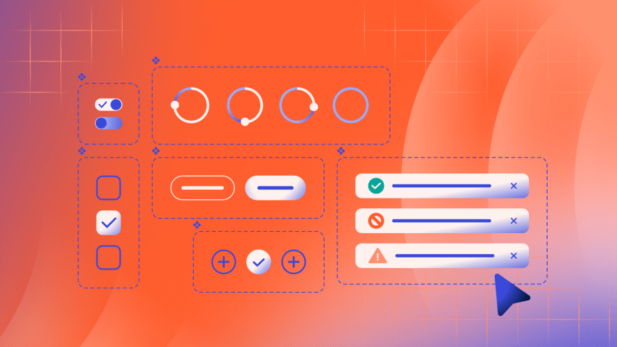
In Figma, when you add a component to your file, it’s called an instance. Instances are linked to their parent component. That means when the library gets updated, the instance gets those updates, too. But how many of us have been in the following scenario:
Ughhhh! I’m on Project Gizmo and I need to deliver designs in just a few days. I’m working so fast and I have a lot of complex components that don’t really meet my needs right now. They seem pretty complicated, so I’m just gonna detach them and make them work for me!
Those thousands of detached components I found in my audit represent situations like this. While we don’t have full visibility on the specifics of a given detached component, we suspect busy designers need urgent workarounds. It’s also possible serial detachers do it out of habit or they simply don’t know that they’re disconnecting components from the design system.
What’s easy isn’t always ideal. When users detach an instance, the link to the component parent breaks. As a result, the instance misses out on critical updates, including functionality and accessibility improvements, and design and brand changes.
Be a better design steward
Especially with the recent release of SLDS 2 (beta) – which includes the new default Salesforce Cosmos theme – it’s more important than ever to pay attention to good practices that support Figma component health. SLDS 2 is also the foundation for future agentic experiences, and having healthy components means you’ll be able to take advantage of innovations to come.
Consider the button icon, which is a workhorse with almost a million instances currently in use. Of that, there are more than 3,000 detachments in the past year. If we were to change the border or background color of the button icon, any detached instances would miss out on those updates. This is just a glimpse into a larger, costly issue:
- Designs that use one-off, detached components don’t consume reusable code and require expensive one-off engineering efforts. This can cause long-term design and code drift and debt, as well as incur accessibility-related costs.
- Detached components might be out of date or incorrect by the time they make their way to engineers. They may not have a 1:1 relationship with coded components, which can cause confusion and churn.
In the end, if users get inconsistent, potentially inaccessible, and incorrect experiences, it erodes trust.


Two ways to improve Figma component health
There are two key ways to reduce the need to detach components:
- Swap internal components: Include commonly used properties to make it easier to customize components.
- Use slot components: Provide slot components to make it easier to swap out content.
By using these features, any changes you make to your local components will propagate throughout your design file. There’s no need to comb through the entire file to find what needs to be updated.
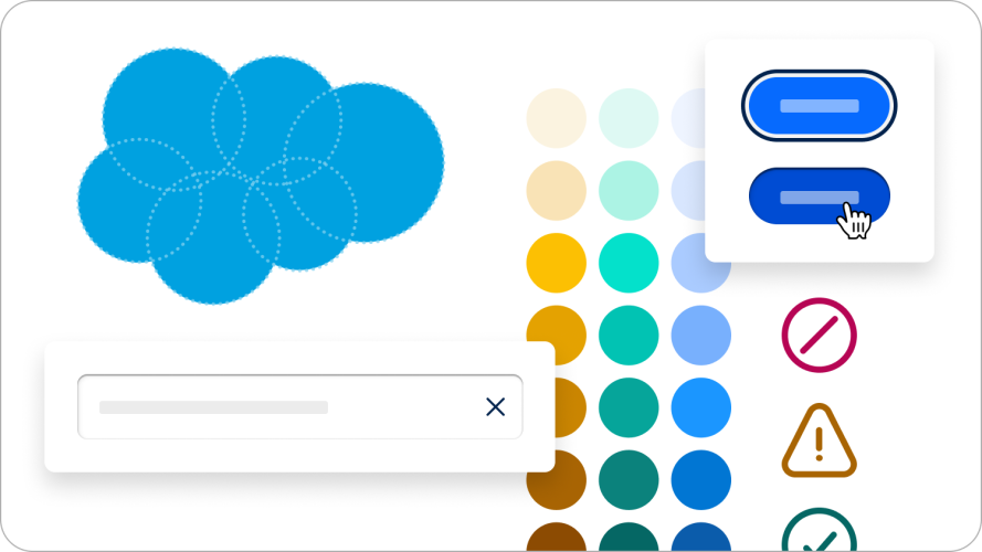
Every SLDS 2 Figma component includes guidelines that show all of the options that are available in the component that can be changed in the properties pane. Let’s consider two examples:
Swap internal components
Let’s say you want to change button style on a header component. Here’s what you need to do:
- Add the component you want to customize.
- Select the button you want to change.
- In the design panel, choose the component you want to change. In the dropdown, navigate to the component you want to replace it with.
- Make the desired changes and update the label.
- When finished, select the option to create a new component. It will now live in the assets pane.
Use slot components
In this example, we’ll demonstrate the slot component called placeholder. It’s a card that can be used for some specific content.
- Add the card component to your file.
- Create the content you want in your card. Be sure to click the auto layout button. Set to fill width and hug height so that it fits the card correctly.
- Add the correct vertical spacing styling hook and create a new component with a unique name. You can only use other components to replace a slot component.
- Go back to the card and select the swap placeholder property. The content component is now in the dropdown under created in this file.
And, voila. Now you have components that you can reuse throughout your design. Any changes you make to this component will propagate through your entire design file.
Let’s stay attached
We’re continuing to track potential problem areas, such as components that don’t work as expected. As our design system evolves, we hope you’ll keep your Figma instances healthy and stay attached.


