How Does AI Change the Future of UI Design?

Here are five tips for how to build user interfaces for AI, starting with embracing probability not predictability.
Are you still grappling with how AI can make you more productive? We’re definitely thinking about the productivity question – and how we might design new AI-enabled experiences that make work easier. What helps is to consider the history of computing as the pursuit of ever more revolutionary ways to make it easier for humans to use computers.
Up until this AI moment, most human-computer interactions have followed a conventional model of “apps that contain sets of functions and require much learning to make use of.” Today, when people have a goal, they navigate to one or multiple complicated apps, spend countless hours across a big mess of clicks, and hopefully achieve their goal.
AI transforms the future of UI (user interface) design dramatically. Instead of apps, you can tell AI your goal, and it can accomplish it for you – no clicking or app learning needed. AI is so incredible because it has the potential to shorten the distance between the goal and the accomplishment.
What’s deterministic versus probabilistic design?
How does AI affect the future of UI design? In traditional product design, we create the interface based on an understanding of a predictable (deterministic) set of data on which the app operates. Designing an app to track your mood? You’ve got a static data model plus a deterministic interface to read and write data into the database. Designing for AI, however, means working with data that is often changing and therefore probabilistic. This shifts the way we design our user interfaces.
At Slack and Salesforce, we’ve been designing for a number of AI features, and here are a few insights from what we’ve learned so far.
Tip 1: Embrace probability
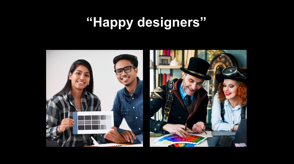
When we design for AI, the data can be influenced by the large language model (LLM) we use. It also can be impacted by the quality of the prompts we give the LLM. Because the data isn’t pre-determined, the results can vary. In these image examples from Midjourney, both are about the same topic. But different prompts give us radically different results.

So when you’re designing a product that incorporates AI, you need to:
- Determine the rough outline of the interface where the result will live.
- Run the prompt to get a feel for the data output.
- Use the data output to validate the outline of the interface.
- Refine the prompt and the interface outline according to the results.
This is an iterative process. As you refine the interface and the output into something more concrete, you may find that revised prompts provide much better data, and that this data requires different expressions in the UI.
Tip 2: Match the UI design to the goal
There are many ways to present AI interfaces from conversational (ChatGPT) to declarative and closed (Slack summaries) to a hybrid format (Adobe Firefly). At Slack, even though we offer one of the most conversational interfaces in the industry, we debate whether conversational interfaces are currently the most intuitive way for people to interact with AI.


Tip 3: Make AI design obvious
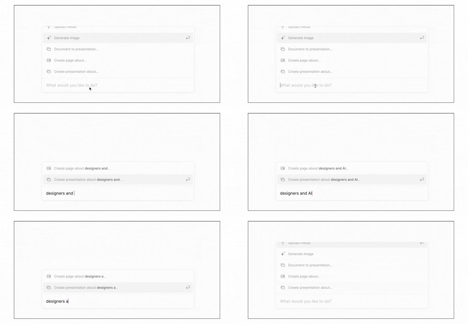
Open-ended prompts don’t always make for great inputs, especially when users don’t know what your AI can or can’t do for them. So, make it obvious. As designers, it’s our responsibility to ensure that the product is designed in a way that is as intuitive and approachable as possible. In this example, Tome starts with an open-ended text box with premade prompts. As you start to engage, they continue the conversation within the text box. Tome makes it obvious what you can do with the AI and they provide clear boundaries that help people understand what they can’t do with the AI.

Tip 4: Create boundaries in the UI design
Especially in open-ended conversational AI systems, it’s important to consider boundaries for the types of questions humans can ask and the responses the AI can return. Remember the stories about people hacking a chatbot to make it spit out bizarre and occasionally scary responses? This happened because there was a mismatch between what people expected the AI to do – provide perfectly intelligent and reasonable output – with its limitations as an entirely probabilistic technology that’s figuring out the best tokens to string in a given order.
By creating boundaries within the UI, we close the gap between expectation and reality. Again, there is a range of ways to approach this depending on the purpose of the AI. On one end of the spectrum, there’s an open-ended conversational UX and, on the other end, is the more closed and pre-determined interface that specifically guides both the user and the AI output. So choosing the right interface design to match the goals of your AI is the first step in creating boundaries. The more closed-ended your interface, the more obvious the boundaries need to be.
If you’re designing for a more open conversational interface, it’s critically important to guide people toward the types of questions or conversations the AI is equipped to handle. Providing prompt examples is a good way to do this. Another way to do this is to strive toward a system of no dead ends. Even when the AI can’t address the conversation, it should be able to provide guidance to your users around what it can and can’t do.
Tip 5: Prototype the path
Designing with AI is new to us all and we’re at the start of a long journey to determine the future of UI design. As more people engage with AI-based design, we’ll start to establish common patterns that become industry norms. But we’re not there yet. This means that we’re all inventing the future. What’s certain is that the technology underlying these interfaces is evolving at a rapid clip. So even when we’ve established our design patterns, the output of these new models means that design for AI is a constantly evolving process.
Yes, we’ll be prototyping the path and learning for a long, long while. Which is so exciting for us as designers. We love to help invent the future for the betterment of our users. And designing for AI gives us that opportunity.
Explore Slack AI
Learn how Slack AI empowers everyone during every part of their workday.


