The right information isn’t useful if you can’t find it. Trailblazers in every role – from Admins and Designers to Architects and Consultants – face the challenge of simplifying the user experience of record pages.
We spoke to #DreamDesigner Shahida Robertson for tips on how to successfully redesign. Her client was a donor relations team at a girls’ education nonprofit. They recognized that key donor information was buried amid cluttered Salesforce page layouts.
There were too many fields – many redundant or irrelevant to common record types. Coordinators couldn’t reply to donor questions promptly. As a nonprofit that relies on generous contributions from supporters, any barriers to relationship building are detrimental. With the help of Robertson, the nonprofit got a page layout makeover that reduced the field count by 40%.
Initially, up to 80 fields crowded one page layout. Robertson conducted UX research to find out why. This is a best practice on her projects at Slalom, a global consulting firm focused on strategy, technology, and business transformation.
How to clean up record pages
Her research confirmed that users would create new fields if they didn’t see them on the page. However, many fields were on the page. The clutter just made them hard to find. So the team agreed to deprecate dozens of fields. “Let’s see only what we need to see, when we need to see it,” Robertson said. “The user experience is everything.”
Most of Robertson’s clients invest in the Salesforce Nonprofit Success Pack. Usually, she assesses whether there are any ways to simplify the user experience by using page layouts and record types. She made progress with field organization this way but the pages were still lengthy.
With a project like this one, more segmentation was necessary. That’s when she turned to Dynamic Lightning Pages.
When to remove fields from a record
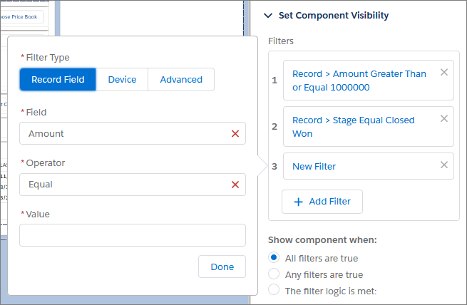
Sometimes you need to display all the fields. Most of the time, you don’t. Robertson added filter conditions and logic to control when a component appeared.
For example: When a donor wants to make a donation, there are additional fields where they can specify the honoree’s name, birthday, gift amount, and address for a thank you card. However, if a coordinator is checking the record of a donor who gave anonymously, these fields would all be irrelevant and blank. In the latter scenario, Robertson took those fields out of the page layout. It was easy with component visibility properties.
Now, her clients could find donor information with less clutter.

Simplify the user experience
Today, coordinators can quickly respond to donors’ email inquiries about topics from in-kind gifts to membership cancellations. They know where to find everything in one unified customer profile. This includes the donor’s donation frequency, employer matching, previous communications, and currency type. This redesign led to better user success. While changing a page layout seems minor, it solved a pain point in the donor relations process and other organizational strategies critical to its future.
“I want to help them and they help me, too,” Robertson said, reflecting on her experience working with this nonprofit. Her partners love the work they do. She simply wanted to make it less stressful to do. “This was a really collaborative team. It didn’t feel like work.”
Ready to design page layouts that are easy to navigate? Interested in centering the user experience in your work?
Learn about the Salesforce User Experience Designer certification for aspiring or experienced designers wanting to build and design human-centered experiences on the Salesforce Platform.


