interactive data visualisation
The Benefits of Interactive Data Visualisation

When it comes to business and big data, more isn’t always better. This is because raw data, when captured and stored in data silos, simply isn’t valuable unless it’s being broken down, evaluated, and acted upon. It’s been suggested that as little as 1% of the world’s data is effectively analysed, with the rest either being captured and held indefinitely, or never captured at all. And as the amount of data being created on a daily basis grows from year to year, ever more valuable information is slipping through the cracks.; However, perhaps even more troublesome is when data is properly analysed, and nonetheless still goes to waste. Bad data, which is to say data that is either inaccurate or incorrectly analysed, has been shown to cost businesses as much as 25% of their revenue in certain situations. But it doesn’t have to be this way. Often, getting the most out of analysed data is simply a matter of understanding data visualisation.
What is Data Visualisation?
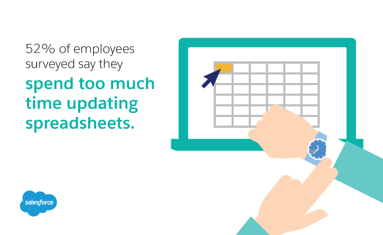
Data visualisation is a term used to describe the use of visual elements to better express the significance of data. Data visualisation can take the form of charts, graphs, tables, or elements, and is an essential aspect of business analytics. Data visualisation makes it possible for decision makers, particularly those without a background in statistical analysis or computer science, to quickly and effectively comprehend analytical data. But while data visualisation can refer to something as simple as a spreadsheet, there are still a number of problems inherent with this form of visualisation, in that it is too time consuming. In fact, 52% of employees surveyed say they spend too much time updating spreadsheets.

Coupled with the difficulty of locating specific information, and the high potential for confusion, this method may actually cause an organisation more harm than good. Modern analytics software has improved upon the concept, and taken it much further, through the use of interactive data visualisation software.
Benefits of Interactive Data Visualisation Software
Interactive data visualisation allows users the freedom to fully explore analysed data. This provides many unique opportunities that organisations can benefit from. Here are three key advantages of using interactive data visualisation software:
- Identifying causes and trends more quickly
93% of all human communication is visual, and it’s been suggested that the human brain is capable of processing images 60,000 times faster than it does text. As such, it seems like a fairly-inefficient use of time to try to share complex data concepts using words on a page. By reviewing data analysis through the use of easily-digestible imagery (in whatever form that might take), and manipulating that data in order to better understand it, leaders can comprehend and act on valuable information much more quickly. - Seeing relationships between daily tasks and business operations
It can be difficult to fully comprehend how daily-business operations affect a company’s bottom line, but interactive data visualisation makes it possible. By interacting with the data to put focus on specific metrics, decision makers are able to compare specific throughout definable timeframes, identifying cause-and-effect relationships that would otherwise likely be overlooked. - Telling a story through data
Human beings are linear creatures; we like to see how things develop and progress across time. Unfortunately, seeing data presented as a string of numbers does not generally allow for that kind of linearness. On the other hand, by allowing users to interact with data presented in a clearly-visual manner, a data-intensive ‘story’ becomes visible. This promotes better understanding of data.

Visualising Value in Data
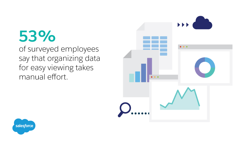
Compiling and comprehending data can be a difficult prospect, with 53% of surveyed employees claiming that gathering data takes actual, manual effort. However, with the right business analytics tool, and an effective data visualisation program, that effort doesn’t have to be wasted. Data visualisation empowers users with the ability to get real value from their captured data, and given how much data is available, this is an advantage that no business should pass up. After all, all the data in the world won’t do your business any good sitting untouched in a silo, and even data that has been mined and analysed may ultimately fail to provide any benefit, unless you are able to quickly and easily comprehend its significance. Simply put, the real value of data lies in your ability to understand it, and for that, data visualisation is an absolute must.
Questions? We’ll put you on the right path.
Ask about Salesforce products, pricing, implementation, or anything else. Our highly trained reps are standing by, ready to help.


