Tableau Users Kick off the Big Game with a Data Blitz


The entire Salesforce community, including Tableau’s #DataFam, is gearing up for Sunday’s Big Game with football-centric visualizations that highlight everything from the players’ hometowns to who has the best odds of winning.
There’s even a Swiftie viz for good measure.
What they’re saying: “One of the greatest things about data is its ability to tell a story. Tableau Public is a free online platform where data enthusiasts can go to create data visualizations about things that they’re passionate about — and the examples shared today are just four of over 9 million visualizations on Tableau Public,” said Elizabeth Maxson, CMO, Tableau. “We love to see sports fans create visualizations about this annual game and share their creations with other Tableau community members.”
Tableau Public is a free online platform where data enthusiasts can go to create data visualizations about things that they’re passionate about — and the examples shared today are just four of over 9 million visualizations on Tableau Public.
Elizabeth Maxson, Chief Marketing Officer, Tableau
Members of the Tableau community flex their skills with four new visualizations
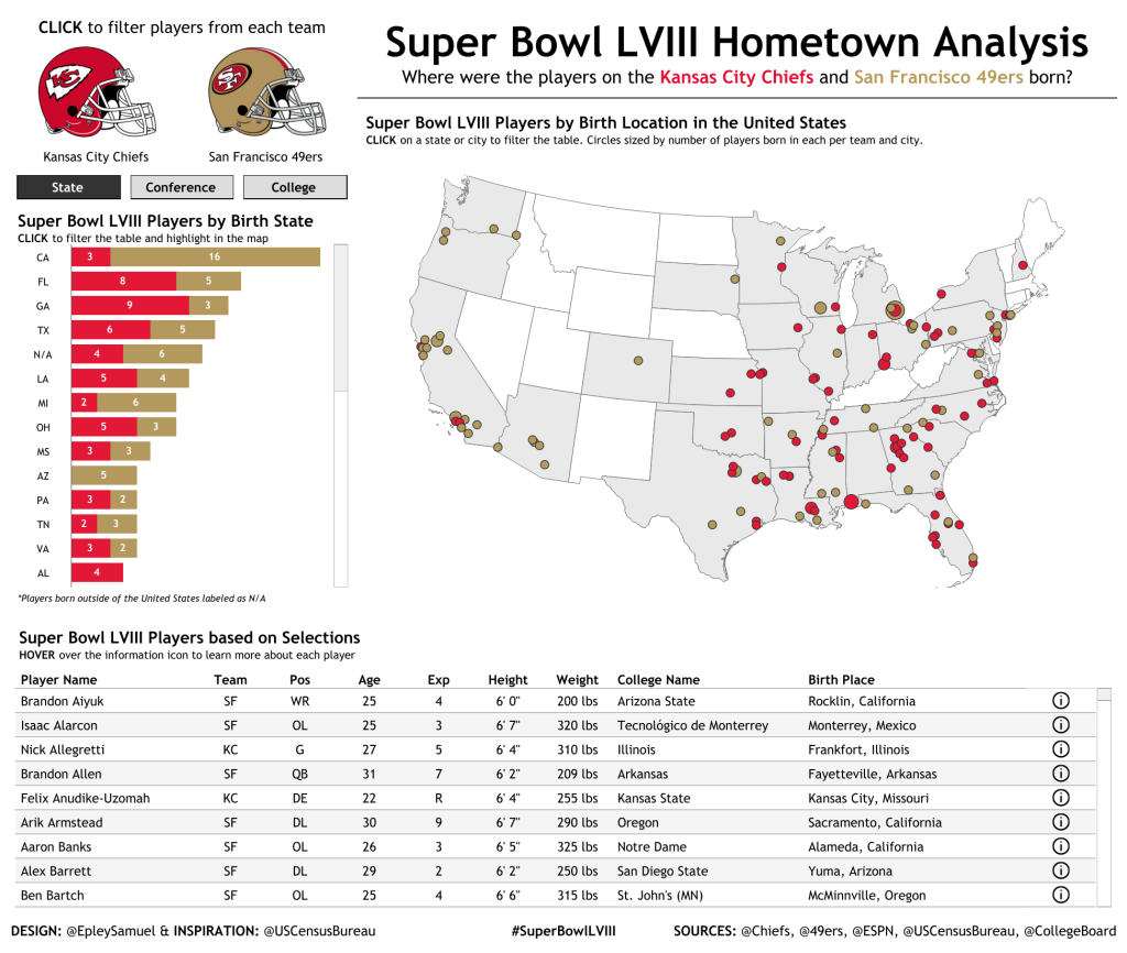
This Tableau visualization shows the hometowns of players from both teams:
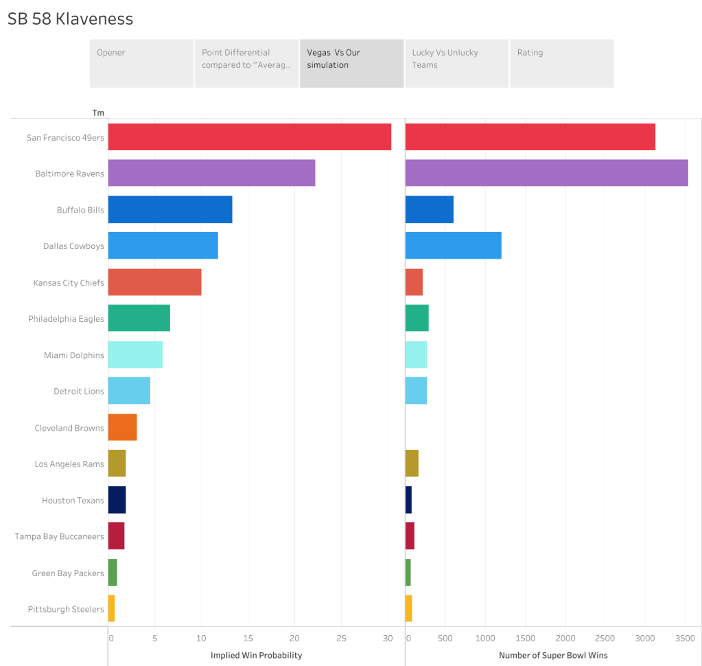
Which football team had the best odds of making it to the Big Game? This Tableau visualization aims to find out:
How close of a game is the Big Game, typically? This visualization shows how past games have shaped up:

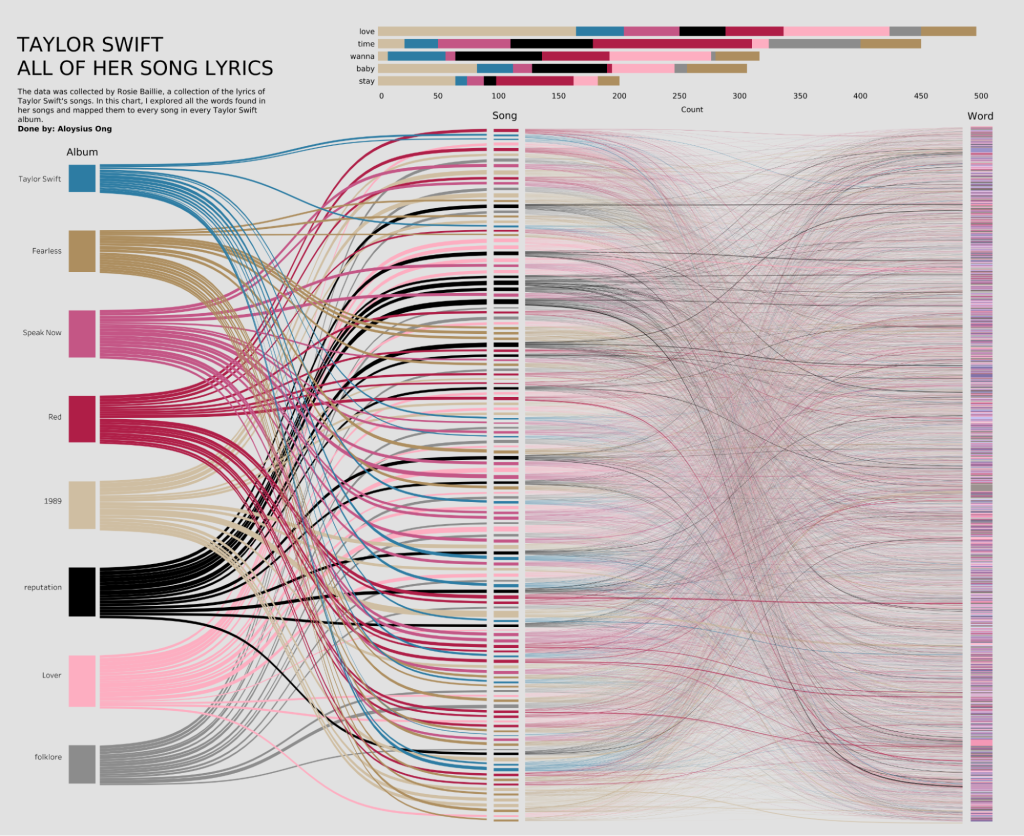
This visualization shows what words make up some of Taylor Swift’s most famous love songs, just in time for the Big Game:
More information:
- Explore more data visualizations on Tableau Public
- Register for Tableau Conference 2024 and attend in person or virtually